Case Study | Pre-Settlement Legal Funding | Legal Funding
Legal Funding Marketing
A national pre-settlement funding brand built to feel fair in an industry people do not trust
How a new legal funding company came to us with a name and an idea and left with a brand position, a logo exploration that ran four rounds deep, a website designed through five versions and a coming soon page, a library of campaign imagery, ongoing content and newsletters, and a public relations program delivered in English and Spanish.
The Client
Fair Legal Funding
Fair Legal Funding advances money to personal injury plaintiffs while their cases work through the courts, so people can cover rent, bills and medical costs instead of settling early for less. The category has a reputation problem: competitors lean on urgency and cash imagery, and plaintiffs and their attorneys approach every funder with suspicion. The founders wanted the opposite, a brand whose name is a promise and whose marketing reads as calm, clear and on the plaintiff's side.
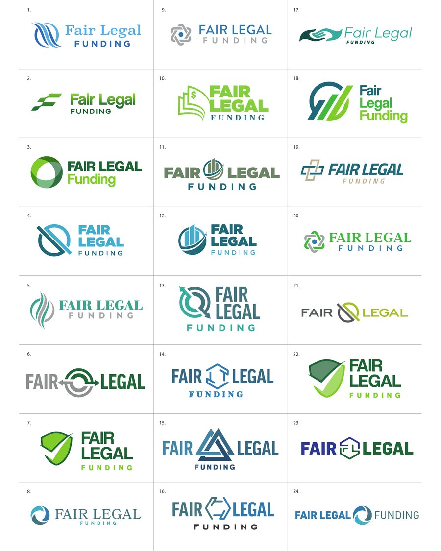
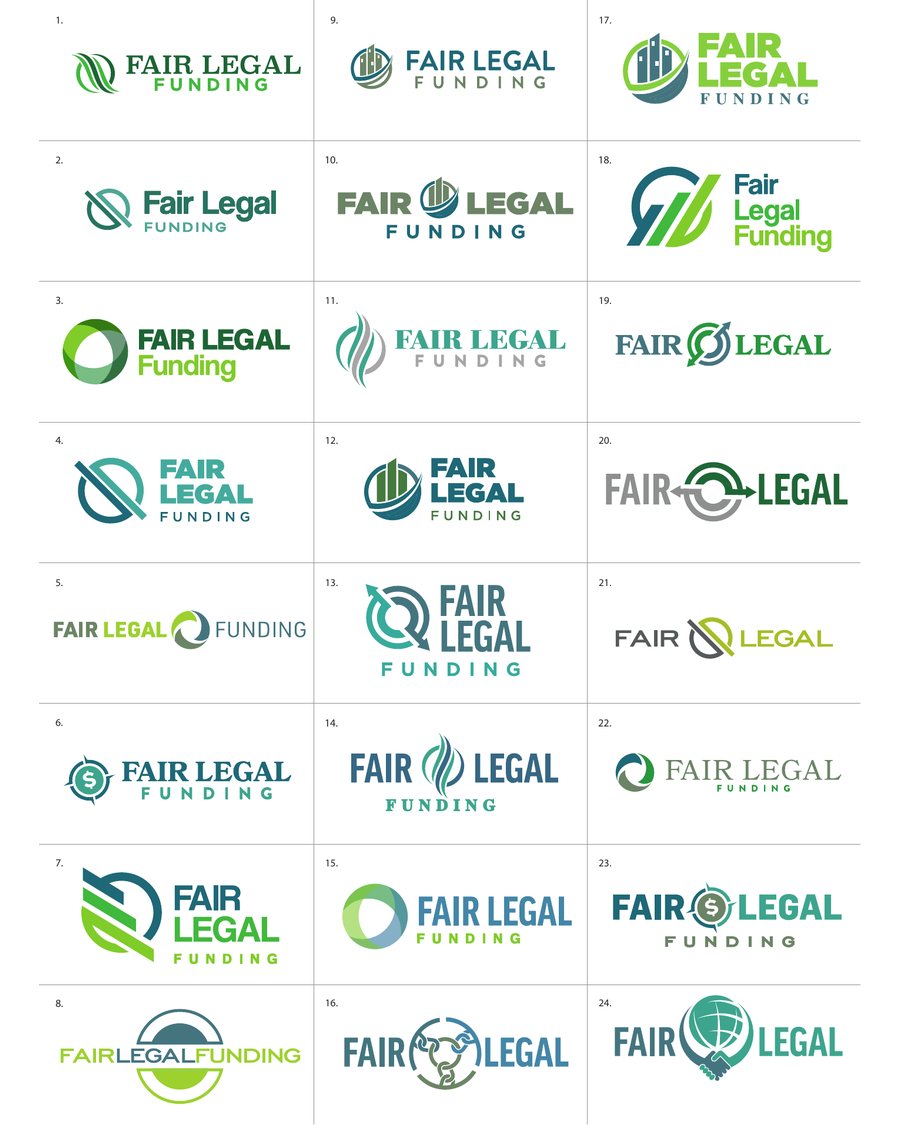
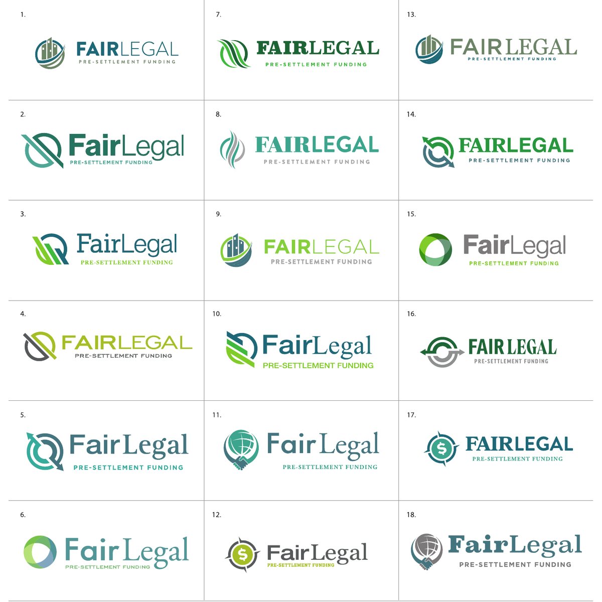
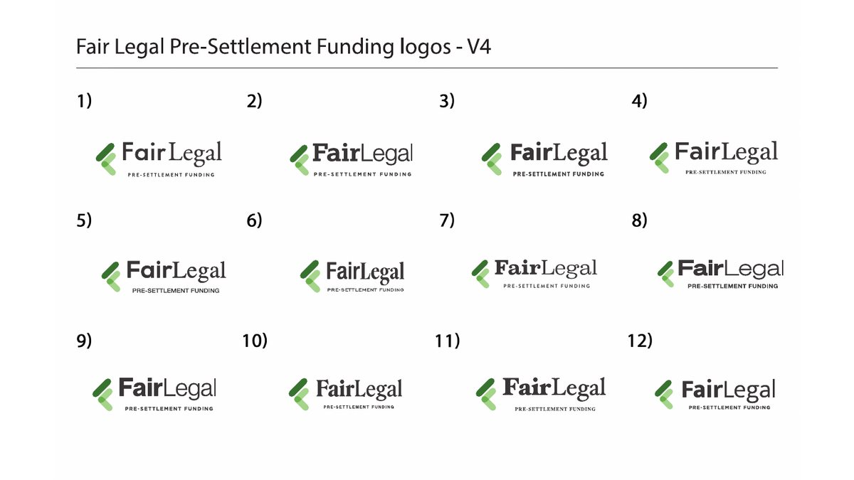
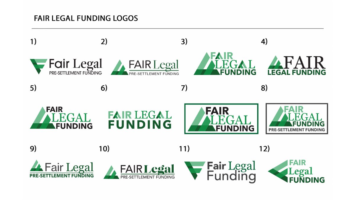
We started with the brand. Four rounds of logo exploration tested more than sixty directions, from shields and scales to leaf and growth marks, and settled the brand's visual language and its "Fair Legal" shorthand. We studied the search landscape of the leading national funders to see how they won traffic and where the gaps were. We designed the website through five full homepage versions plus a coming soon page, each round simplifying the story down to three steps: get in touch, we review, get funded. We built a bank of campaign imagery for the site, ads and social, then ran content, newsletters and a public relations program in English and Spanish to reach plaintiffs and the attorneys who refer them.
Services
By the Numbers
Objectives and Approach
Make Fair the Whole Brand
In a category sold on urgency, the strongest position was patience, clarity and a plain promise.
A Name That Is a Promise
The brand language, logo exploration and site copy all reinforce one word: fair. Terms are explained, not hidden.
Three Steps, Not Fine Print
Every homepage version leads with the same simple path so a plaintiff knows exactly what happens next.
Speak to Attorneys Too
Content and public relations were written for the referring attorney as much as the plaintiff, because the attorney often makes the introduction.
Both Languages, Same Quality
Spanish was not a translation of the English program. It was written and placed for Spanish speaking plaintiffs from the start.
Services Marketed
Funding While the Case Works
Brand Exploration
Four Rounds to a Visual Language
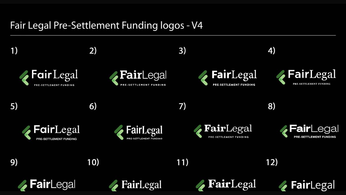
Selected sheets from the logo exploration: the first wide round, the refinements, and the final "Fair Legal" direction in light and dark.
Website
Five Versions, One Simpler Story
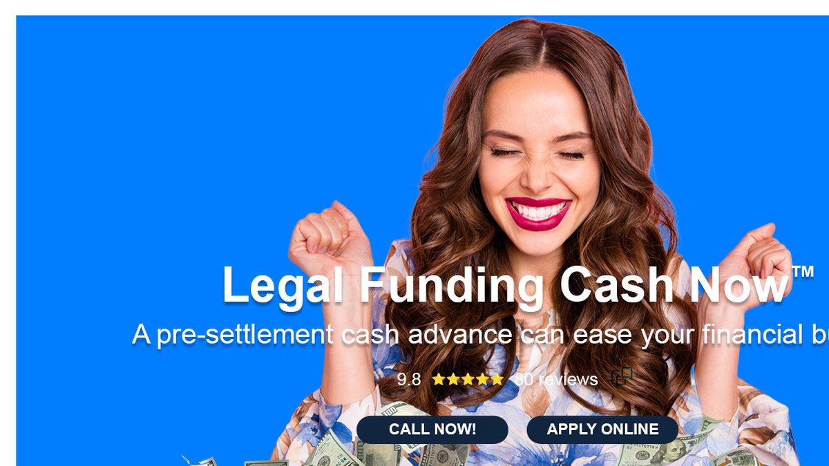
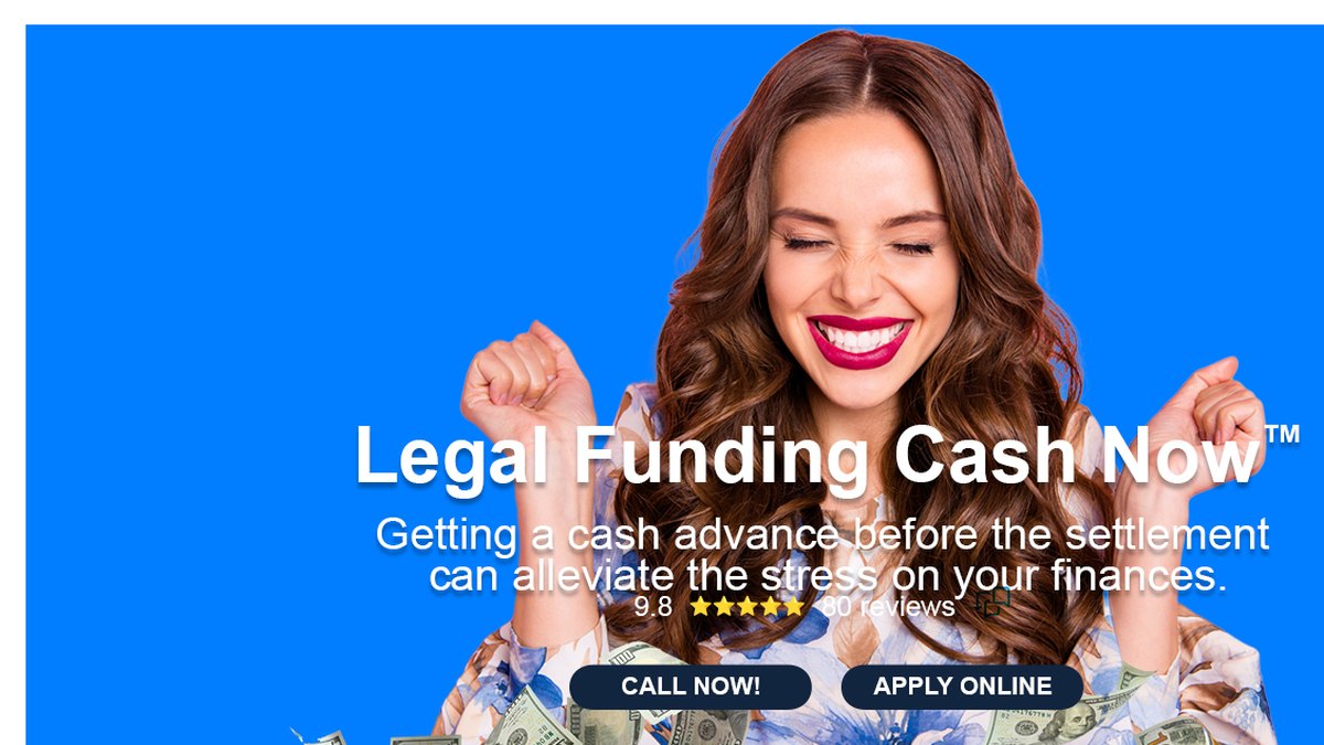
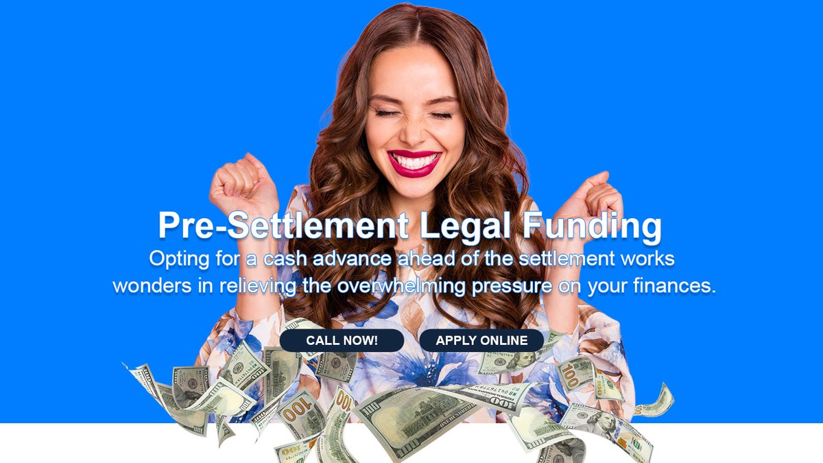
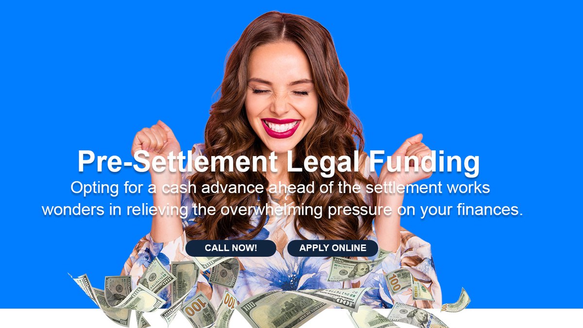
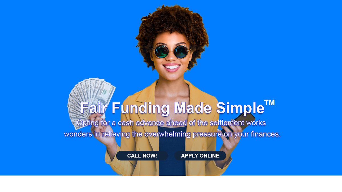
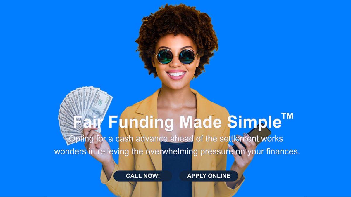
The homepage hero through each round of design, from the first concept to the final build and the coming soon page that held the domain before launch.

Ready to Grow?
Want Growth Like This for Your Business?
Our New York team builds the brand, the website and the marketing that bring in new customers and keep them coming back. Tell us where you want to grow and we will map out the plan with you.
Book Your AppointmentCampaign Imagery
Relief, Not Pressure
The image library built for the site, social and newsletters: people getting the call, meeting their attorney and getting on with life.






What We Managed
Brand, Site and Voice
Impact Summary
A Funder That Sounds Like the Good Guy
A new entrant in a distrusted category launched with a brand built on one word, a website that explains itself in three steps and a bilingual voice that reaches plaintiffs and the attorneys who refer them. The same approach fits any financial or legal services brand that needs to earn trust before it earns a call.
See How We Market Legal and Financial Brands