Case Study | Food and Beverage | Taco Restaurant Branding
Taco Restaurant Branding New York
Papi Tacos and Churros, from one shop to a local favorite
Papi Tacos and Churros serves authentic Mexican street food, from birria slow cooked for sixteen hours to churros made from scratch. We helped shape the name and built the brand behind its growth: logo, identity, packaging, print, stationery and signage, ready to roll out to every new location.
The Client
Papi Tacos and Churros
Papi's story began with a family sharing its authentic street food with the people around them. Serving its community since 2018, it built a following on birria tacos crisped in rich consommé, quesatacos, burritos, mulitas and fresh churros with homemade dulce de leche, and word of mouth carried its name far beyond the neighborhood.
As the brand grew from its original first shop to new locations across the city, it needed an identity that could scale: instantly recognizable, full of flavor and easy to roll out store after store.
Services
At a Glance
Before and After
From a Name to a Brand
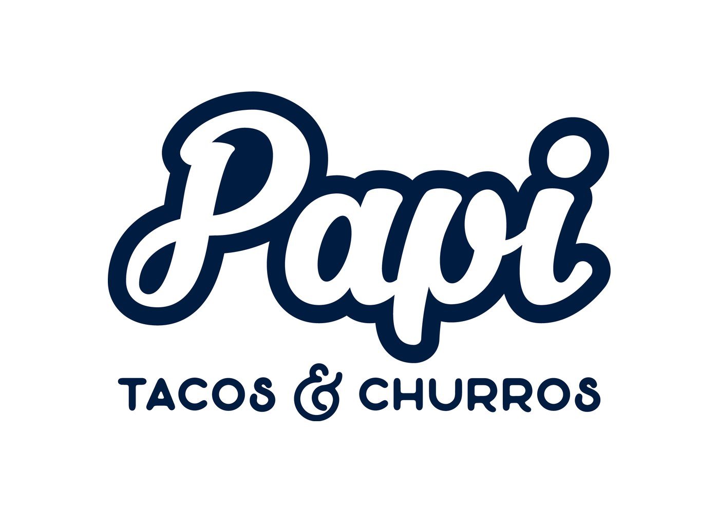
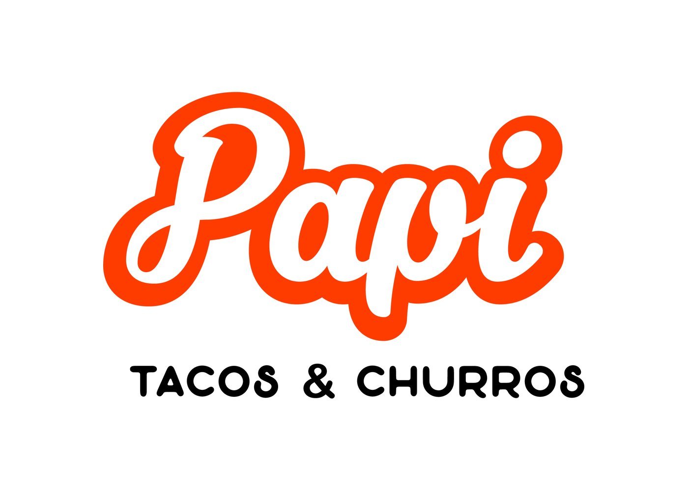
Papi started with a simple script and a plain navy palette that did not capture the heat, color and fun of the food. We refined the name into Papi Tacos and Churros, so every customer knew exactly what to expect, and rebuilt the identity around bold orange, a playful script and a story you can taste.
Logo Concepts
Eight Directions, Shown on the Box
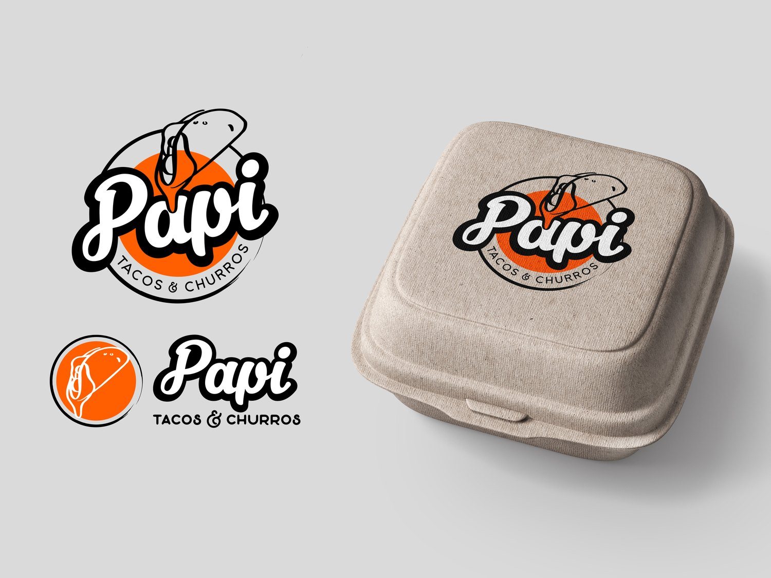
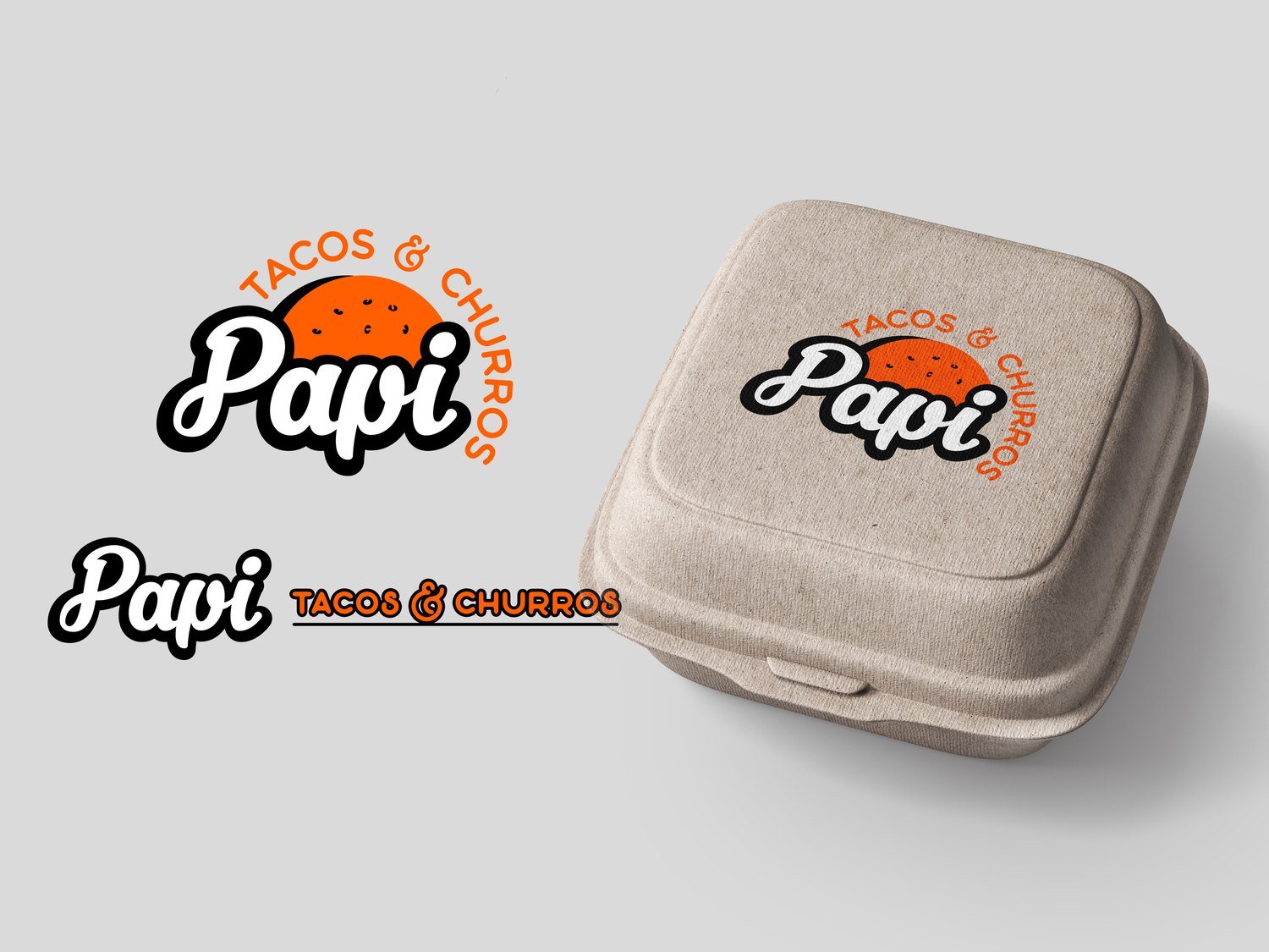
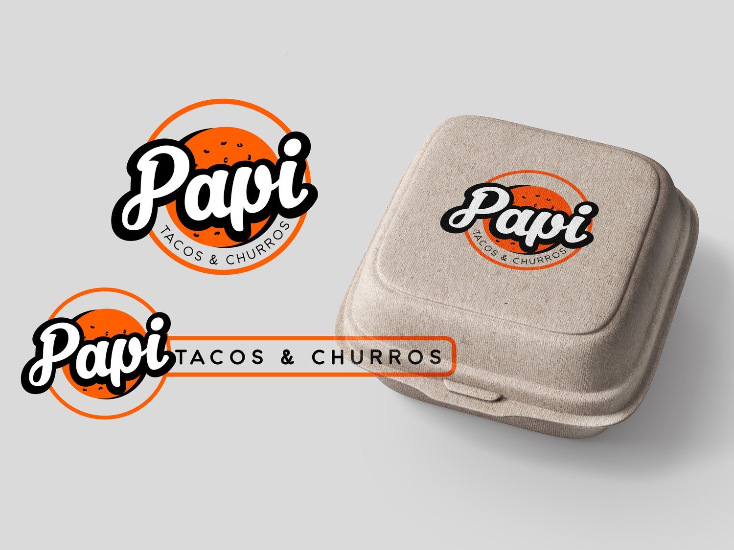
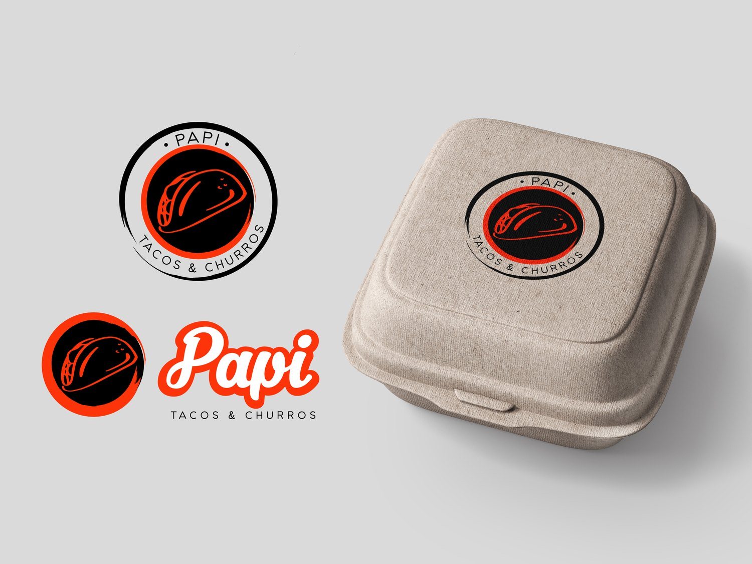
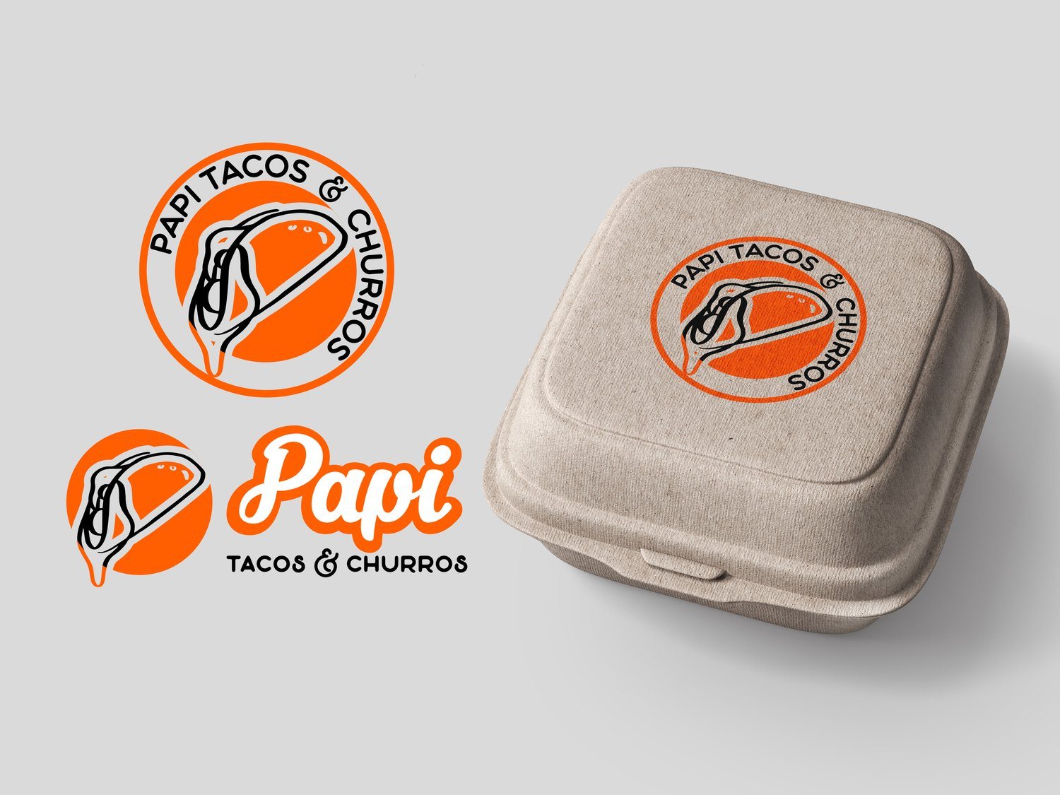
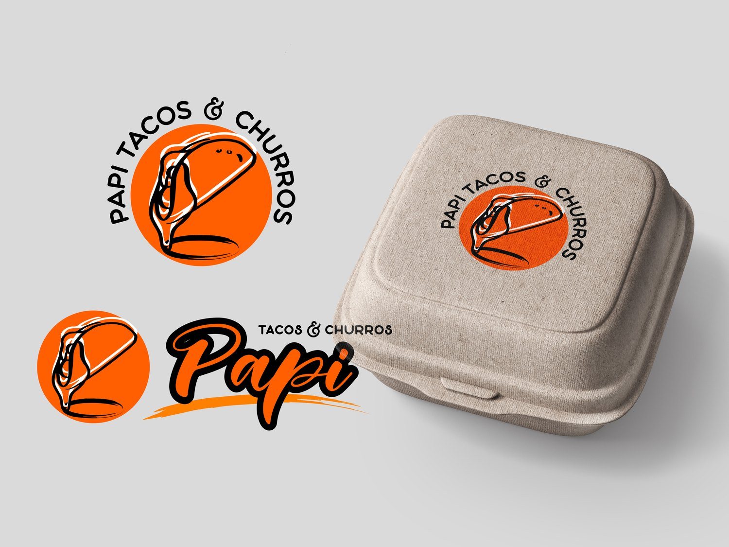
A restaurant logo lives on packaging first, so we presented every concept on real takeout clamshells. Eight directions explored badges, scripts, stamps and illustrated icons, from a taco being dipped in consommé to classic street food lettering, giving the owners a true sense of how each would look in a customer's hands.
Refinement
Dialing In the Flavor
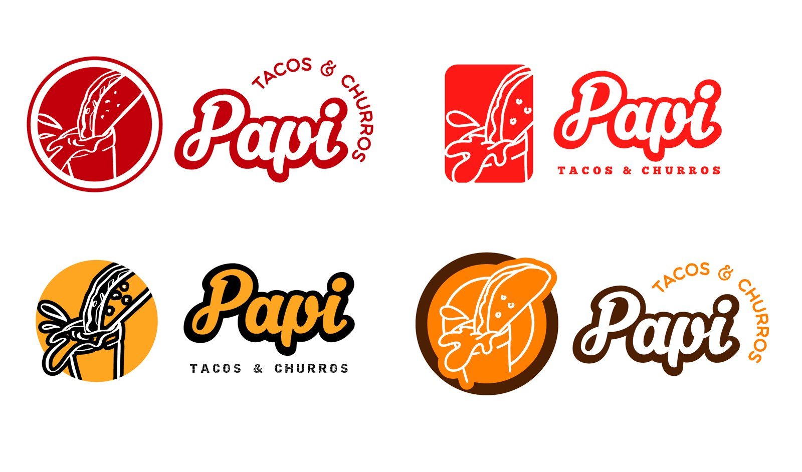
The owners loved the icon of a taco dipped in consommé, the signature move of birria. In the second and third rounds we tested palettes from deep red to warm gold and brown, then settled on a vivid orange that pops on storefronts, cups and screens, paired with a bold, friendly script.
The Final System
Built to Scale, Store After Store
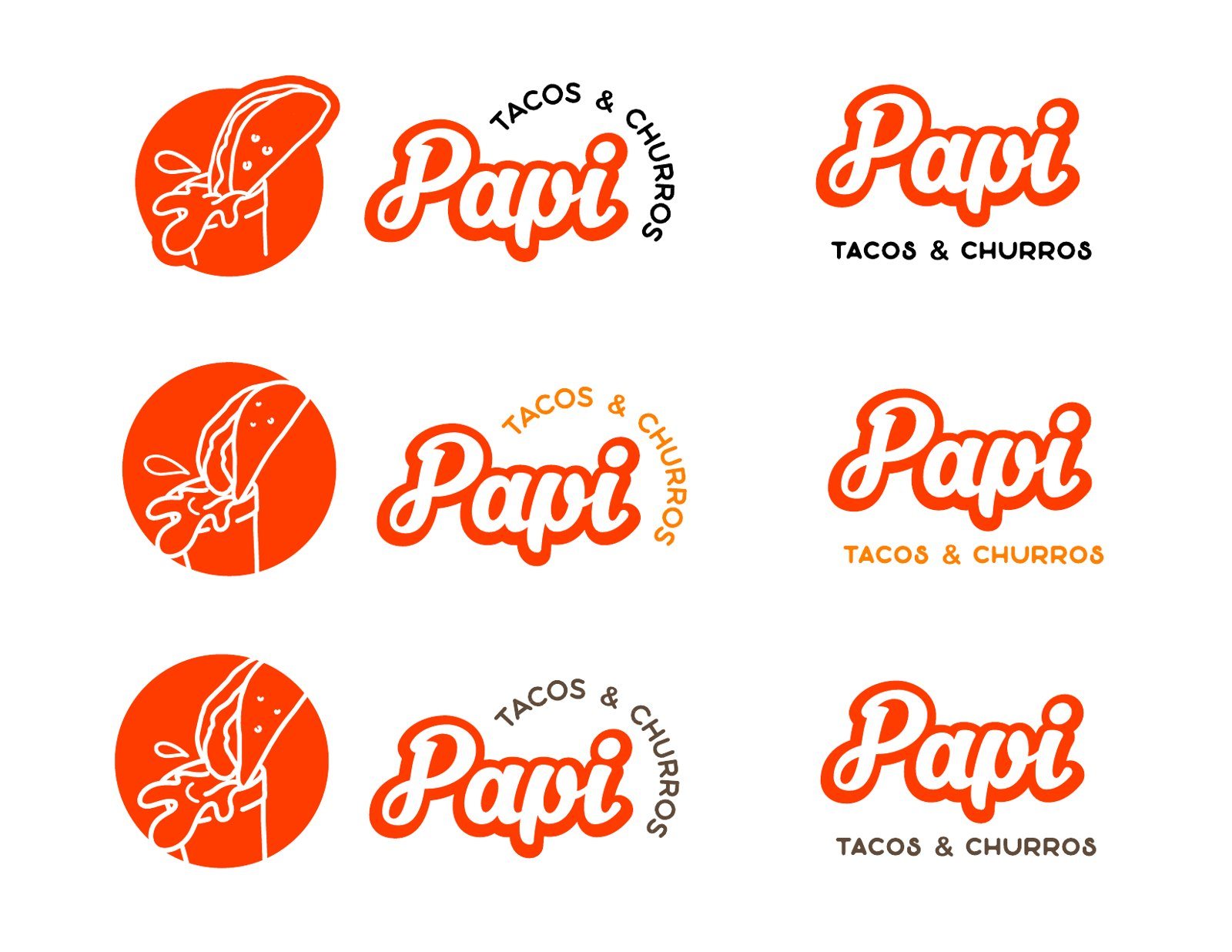
The final identity is a flexible system: a stacked lettermark, an arched version where Tacos and Churros wraps around the name, and a standalone icon in solid, outline and two color variations. Together they cover everything from signage and menus to cups, bags, stickers, uniforms and social media, so every new location launches looking unmistakably Papi.



Ready to Grow?
Want Growth Like This for Your Business?
Our New York team builds the brand, the website and the marketing that bring in new customers and keep them coming back. Tell us where you want to grow and we will map out the plan with you.
Book Your AppointmentPrint, Stationery and Signage
Orange You Can See From the Street
We carried the new identity onto print, stationery and signage, giving each location a consistent storefront presence and a family of materials that work at the counter and on the go. The bold orange and script lettermark became the face of the brand across the city, from the original shop to every new location.
What We Delivered
A Restaurant Brand Ready to Grow
Taco Restaurant Branding New York
What New York Restaurants and Food Brands Can Take From This
Restaurants and Food Brands in New York compete for attention online and offline every day. The ones that grow pair a brand people remember with marketing that reaches the right customers at the right moment, and they keep showing up long after the first impression.
The work in this case study is the same playbook our New York team brings to restaurants and food brands: a clear brand and identity, a website built to convert, search and social that reach the right people, and content, campaigns and community work that keep customers coming back.
Impact Summary
A Brand as Bold as the Birria
Papi Tacos and Churros had the recipes and the loyal fans. We gave it a name that tells the story and an identity that pops, then a complete system for packaging, print, stationery and signage that helped the brand grow from a single shop into a local favorite with multiple locations.
See Our Restaurant Marketing