Case Study | Construction and Restoration | Restoration and Construction
Construction Marketing
A veteran-owned emergency construction and restoration company, rebranded twice as it grew
How a licensed general contractor that answers the call when a fire, flood or structural failure hits a home, a business, a city facility or a Fortune 500 site went from a three-letter brand to a five-letter one. We built both: the original identity in 2017, the full rebrand as the company added electrical and construction, the gear the crews wear on site, the website and landing pages, the business cards for a growing team, and the company event we produced and filmed when they had something to celebrate.
The Client
Victorious Creed
Victorious Creed is a veteran-owned general building contractor licensed for demolition and asbestos abatement, built for the worst day: emergency response when property is damaged, structural demolition and environmental cleanup when things go wrong, and the construction that follows. The client list runs from homeowners and small businesses to city and county agencies and Fortune 500 companies, which means the brand has to look as credible in a boardroom as it does on a jobsite.
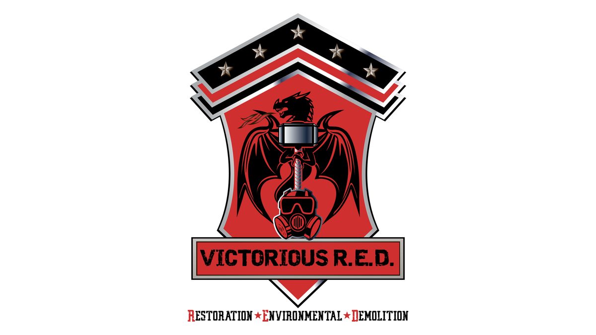
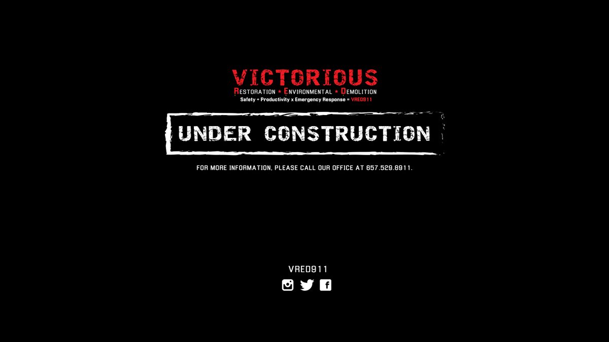
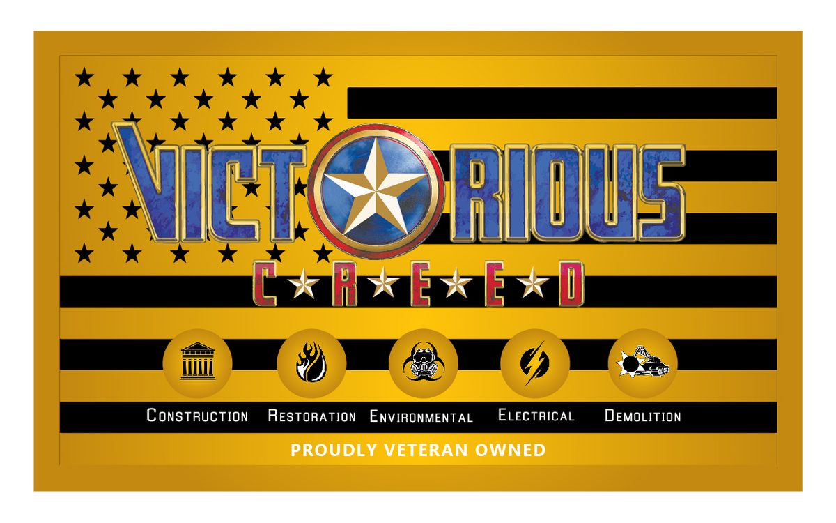
We have been with the company since its first license. In 2017 it launched as Victorious R.E.D., for Restoration, Environmental and Demolition, and we designed the name treatment, crest, business cards and first landing page. As the company grew into electrical and full construction, the name grew with it: Victorious C.R.E.E.D. We rebuilt the identity from the ground up, a star and shield system in navy, gold and red, a gold icon for each of the five divisions, a Veteran Owned mark, uniforms and jackets for the crews, a new website and an under-construction landing page, and business cards for a team that had tripled. When the company threw its holiday party, our team produced the event, photographed it and cut the sizzle reel.
Services
By the Numbers
Objectives and Approach
Make a Contractor Look Like the One You Call First
Emergency work is won on trust in the first five minutes. A city facilities manager, an insurance adjuster and a homeowner standing in a flooded kitchen all need to see the same thing: a company that is licensed, organized and proud of its people. Every piece we built was designed to say that before anyone reads a word.
Name That Grows
From R.E.D. to C.R.E.E.D.: the acronym carries the divisions, so when the company added electrical and construction the brand told the story on its own.
Identity System
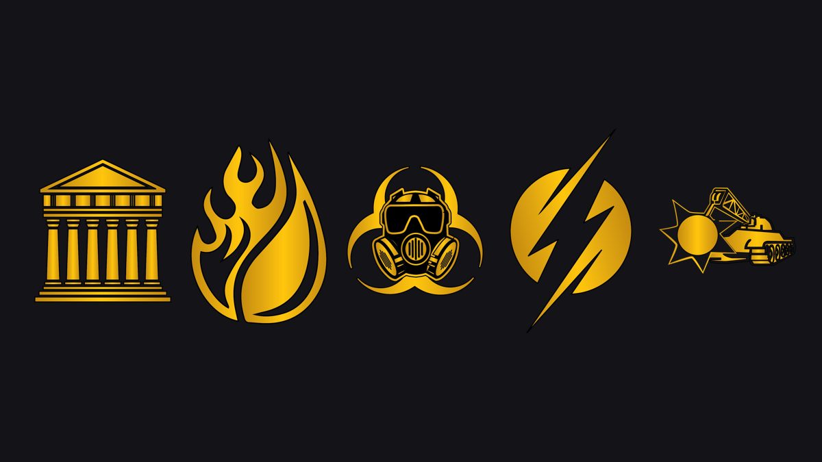
A star and shield mark in navy, gold and red, a wordmark, five gold division icons, a Veteran Owned badge and flag, and a Team Captain badge, all built for embroidery and print as much as for screens.
Gear as Marketing
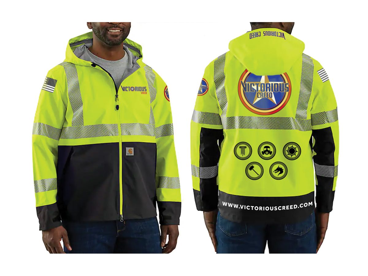
Hi-vis jackets and vests, polos, long sleeves, hats and helmets. On a jobsite the uniform is the billboard, so the crew became the campaign.
Web, Print and Events
A full website design, an under-construction landing page that still captured leads, a card system for the team, and a company event we produced, shot and cut into a reel.
Services Marketed
Five Divisions, One Brand
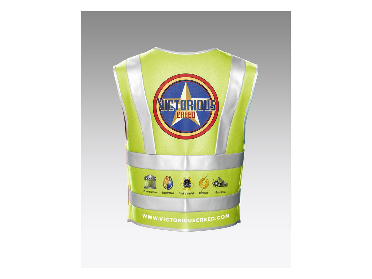
Each division got its own icon and its own place on the card, the vest and the site, so a client knows at a glance that one company can handle the whole job.
Brand
From R.E.D. to C.R.E.E.D.
The 2017 identity on the left, the rebrand on the right. Same company, same owner, a much bigger promise.
Uniforms and Gear
The Crew Is the Campaign
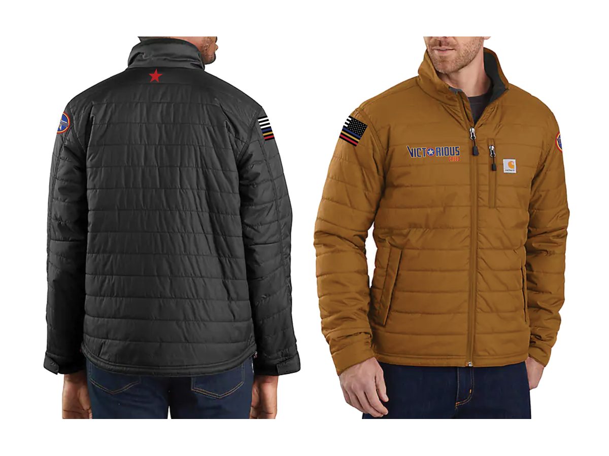
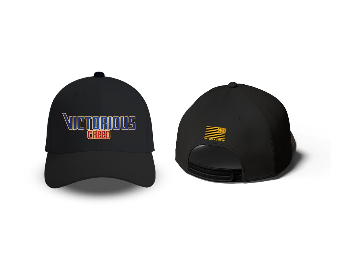
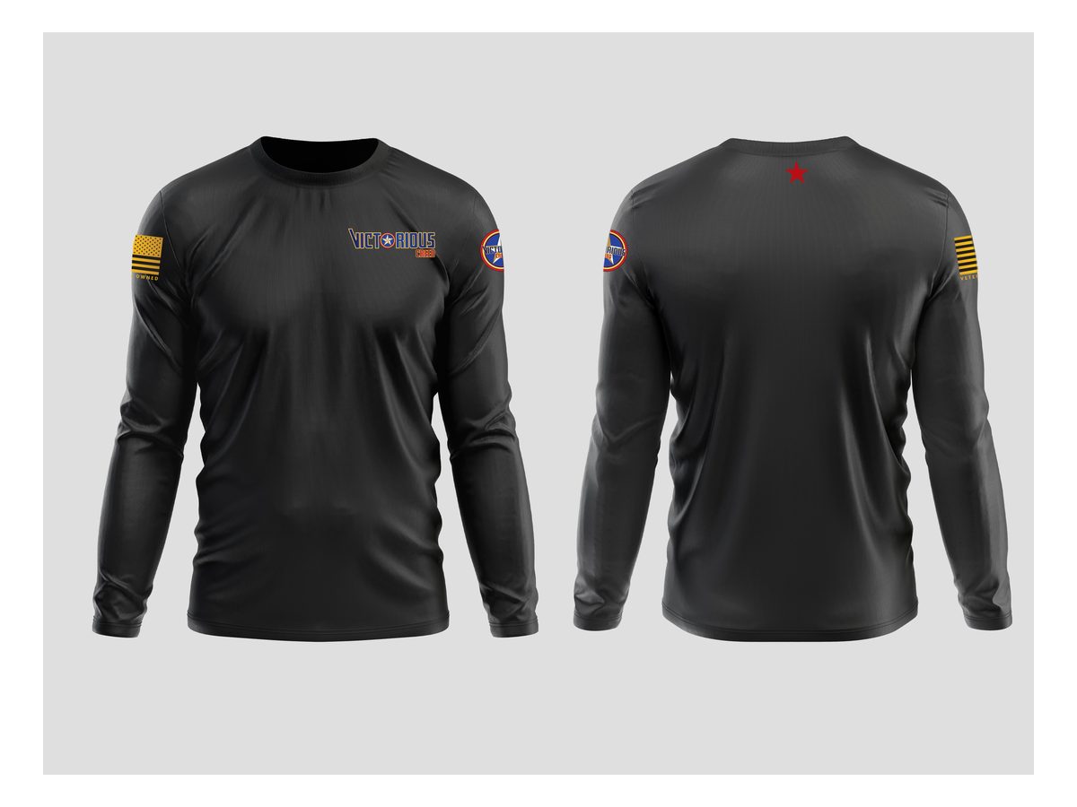
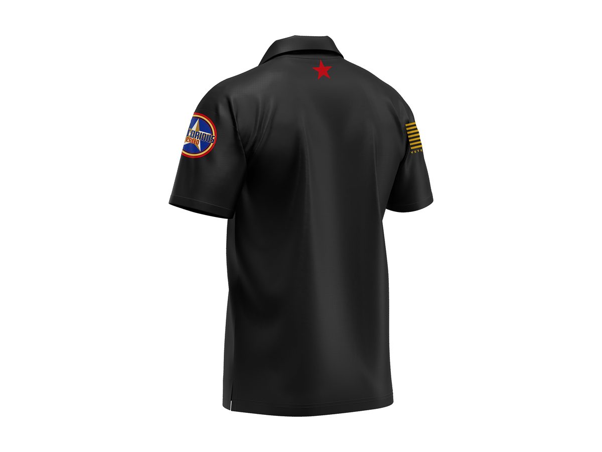
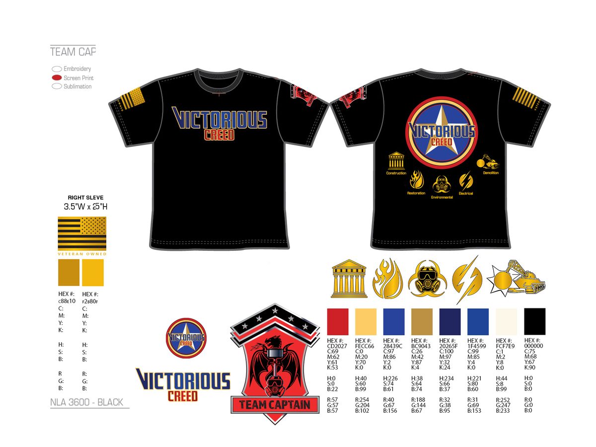
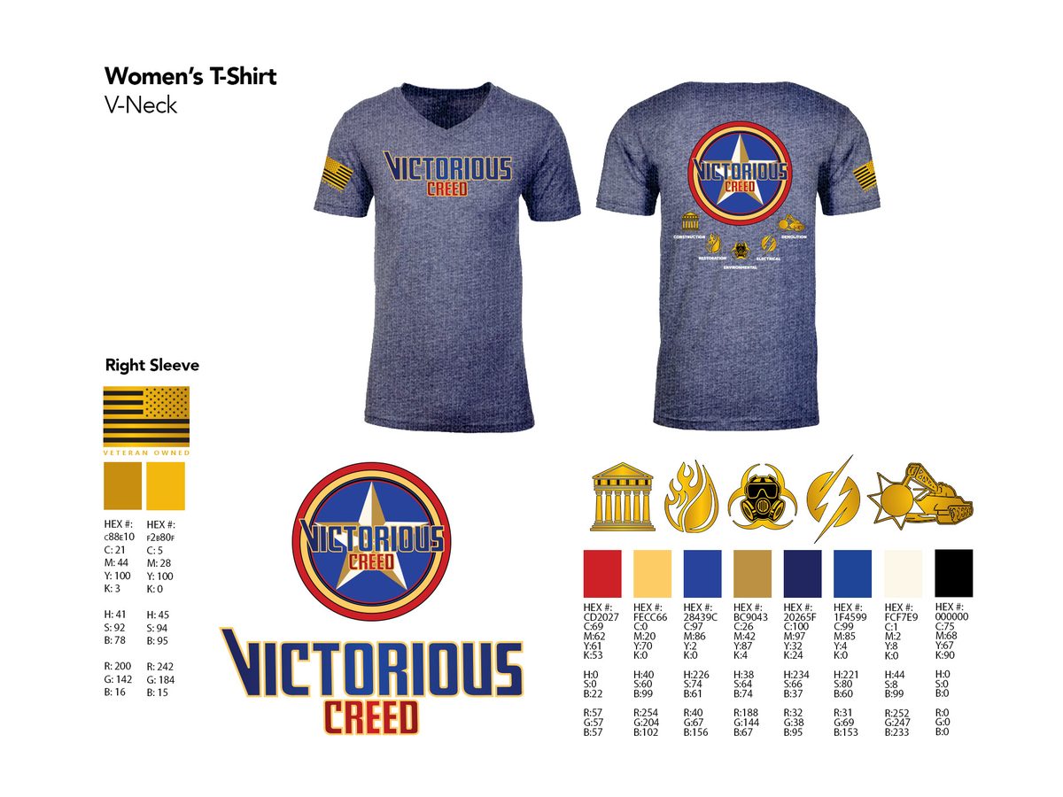
Hi-vis safety jackets and vests with the shield on the back and the five icons across the shoulders, polos and long sleeves for the office, hats and helmets for the field, with spec sheets ready for the embroiderer.
Web and Print
Credible Before the First Call
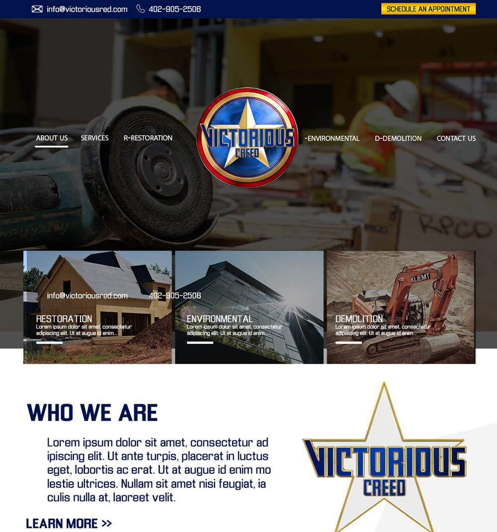
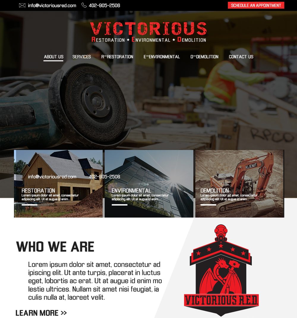
A website design built around the shield, an under-construction landing page that kept the emergency line in front of clients while the site was built, and a card system for the whole team.
On Site
Before the Demolition
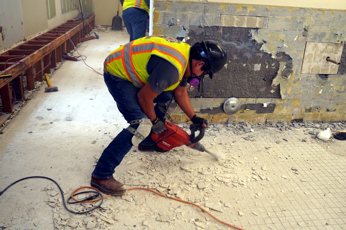
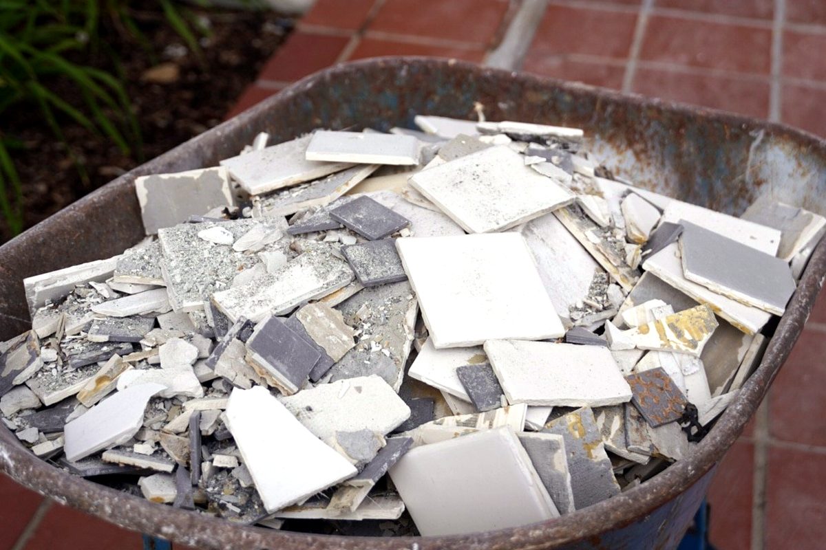
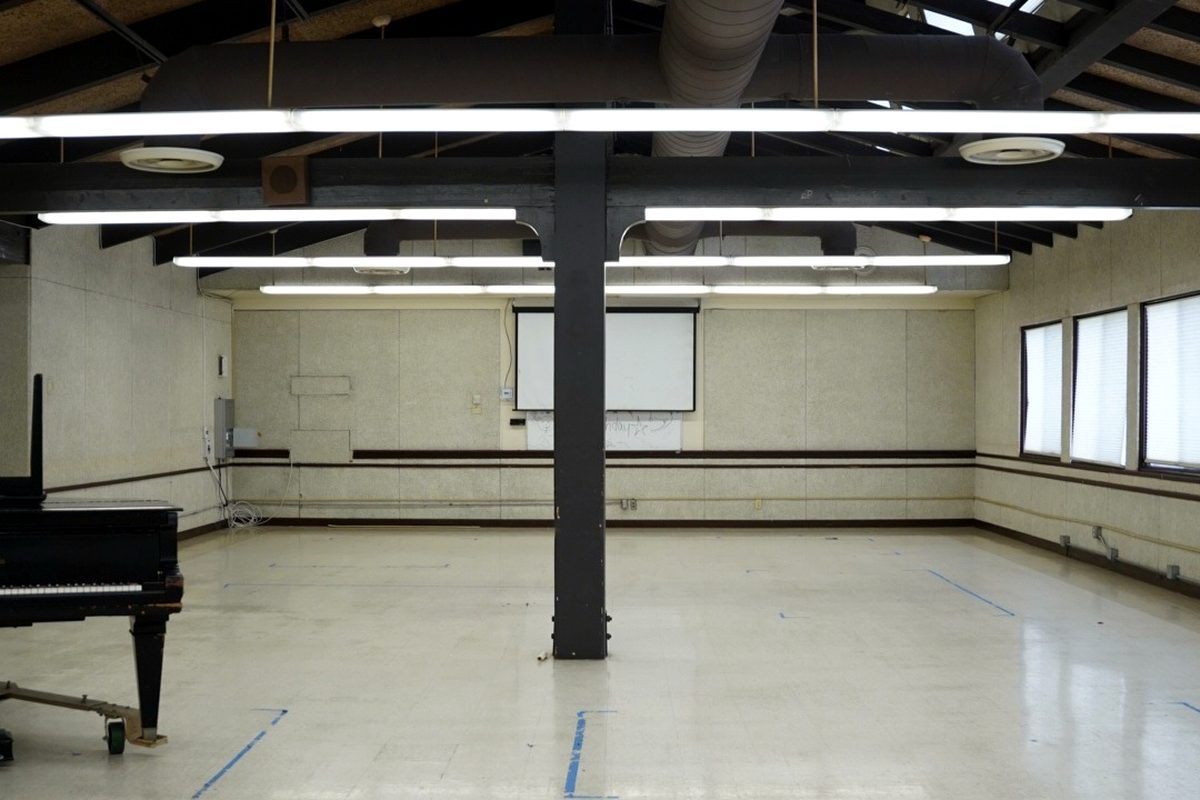
Our photographer documented a senior living community before the crew took it down to the studs, giving the company a before-and-after library for proposals and social.
Events
We Were in the Room
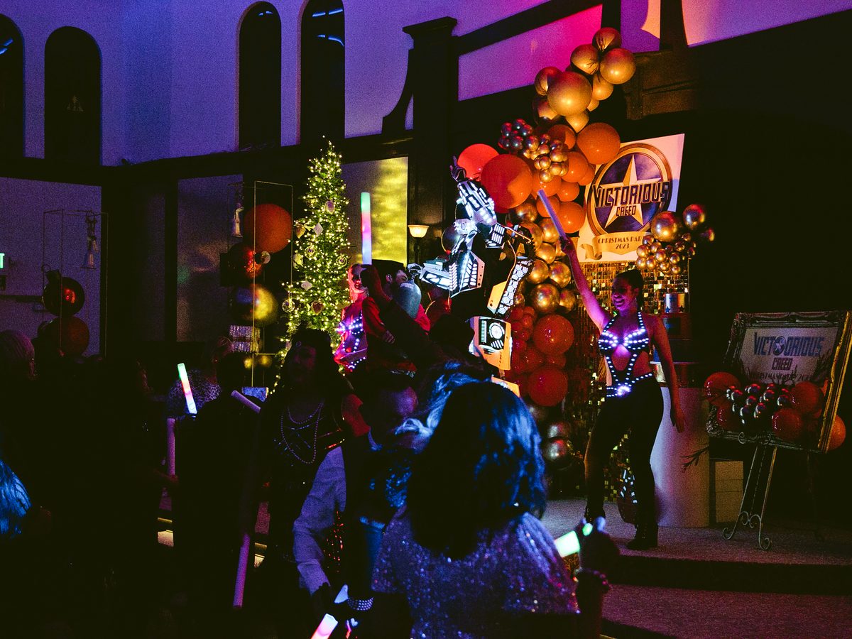
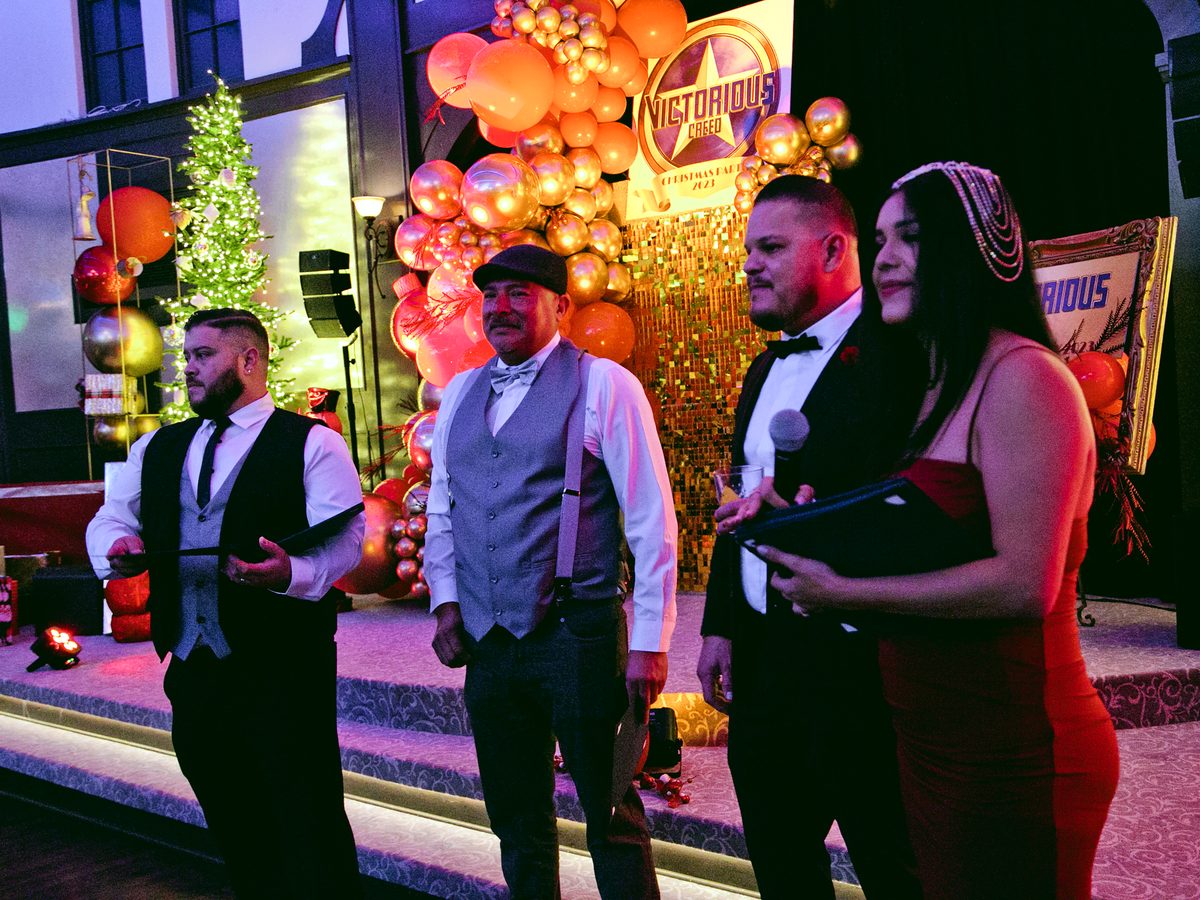
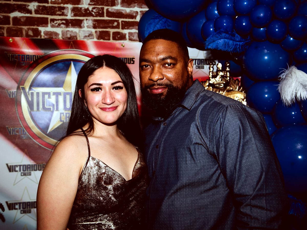
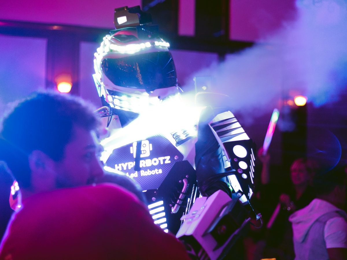
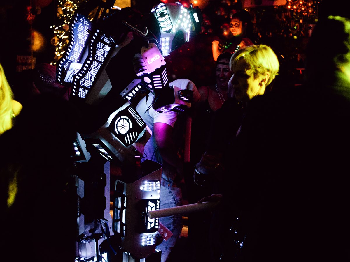
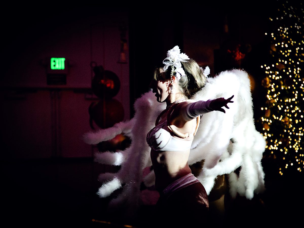
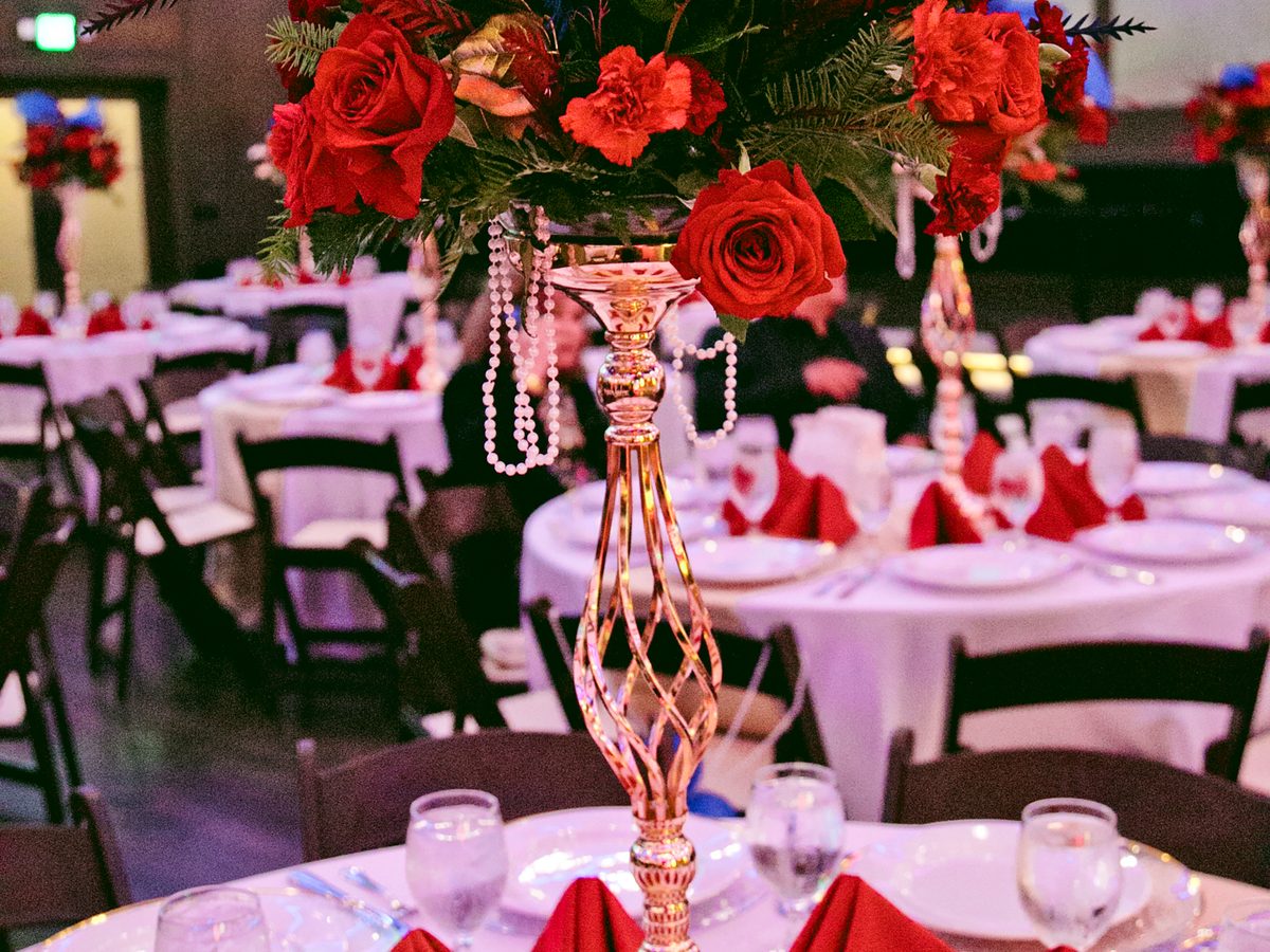
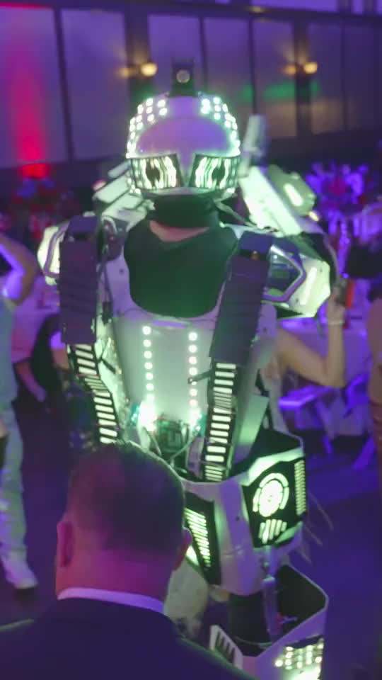
When the company celebrated its year, our team produced the holiday event: branded step-and-repeat, stage, balloon installations, LED robot entertainment and live performers, with our photographers and videographers on site. The reel below is the cut.

What We Managed
A Brand Department for a Contractor
Impact Summary
Any Service Business Can Look Like the Leader
A contractor that started with three letters and a landing page now carries a complete brand across its trucks, crews, cards, site and events, and competes for city, county and Fortune 500 work with the identity to match. The point is not the industry. It is that the same team can take a company that does any service and make it look like the one you call first.
See How We Market Construction and Trades