Case Study | Media and Broadcasting | two western states
Radio Group Branding
A new broadcast company and its stations, branded, rebranded and reintroduced to their markets
How a radio executive leaving major-market broadcasting to buy small-market stations got a corporate identity, a website, a logo and launch for every station in the group, business cards for every seller, billboard and on-air creative, social, email and text, and a digital rebrand reel when the company restaged its brands in 2025.
The Client
A Regional Radio Group
A broadcast company formed in 2021 by a veteran radio production director to acquire and operate small-market radio stations. Its first group, six signals serving three towns in its first market, came with legacy logos, no shared identity and no digital presence. A second group in a neighboring state followed.
We built the company from the mark up: the corporate logo and stationery, the corporate website, a new logo and launch for each station, sales cards for every account executive carrying the whole station family, billboard and on-air creative, social, email and text campaigns for the stations' listeners and advertisers, and in 2025 a digital rebrand reel as the company restaged its brands. The stations were later acquired by a new ownership group.
Services
By the Numbers
Objectives and Approach
One Company, Ten Stations, One System
A new owner inheriting legacy stations has a choice: keep the old logos listeners know, or reintroduce every station at once. The plan was to do the second, with a corporate parent brand strong enough to sell the whole group to advertisers and station brands distinct enough that a country listener and a talk listener never confuse them.
Corporate Identity
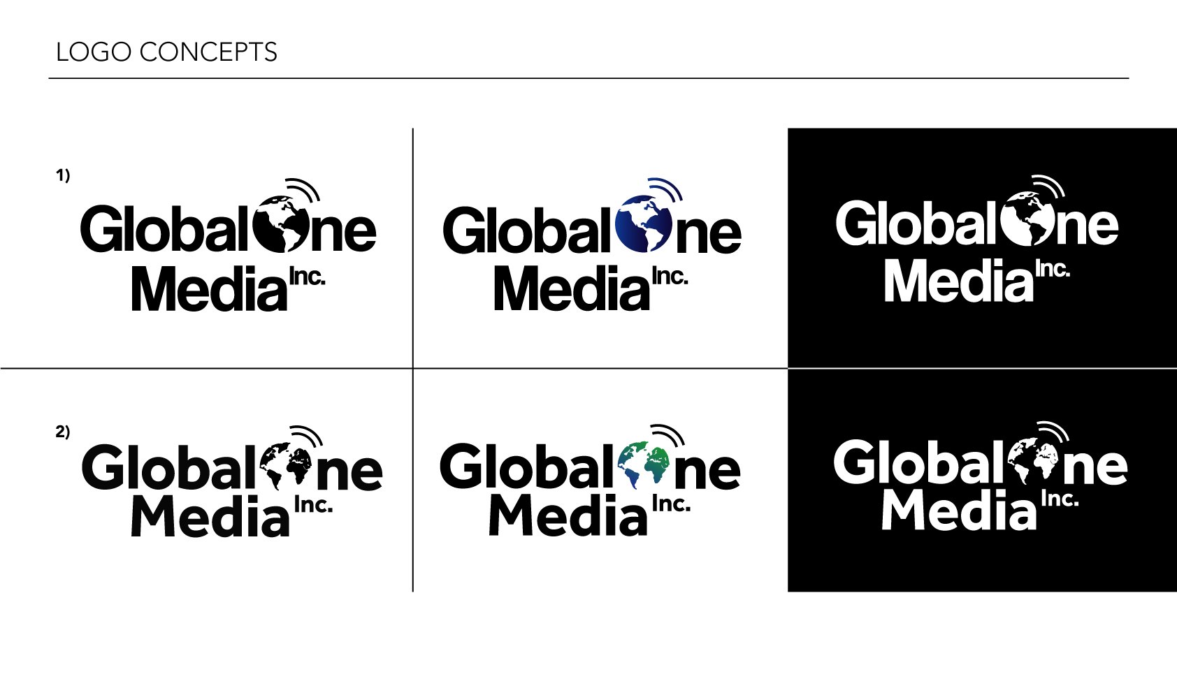
Four rounds of logo concepts to a globe mark that works on a business card, a billboard and a broadcast lower third, with black, white and reversed versions and a favicon.
A Logo for Every Station
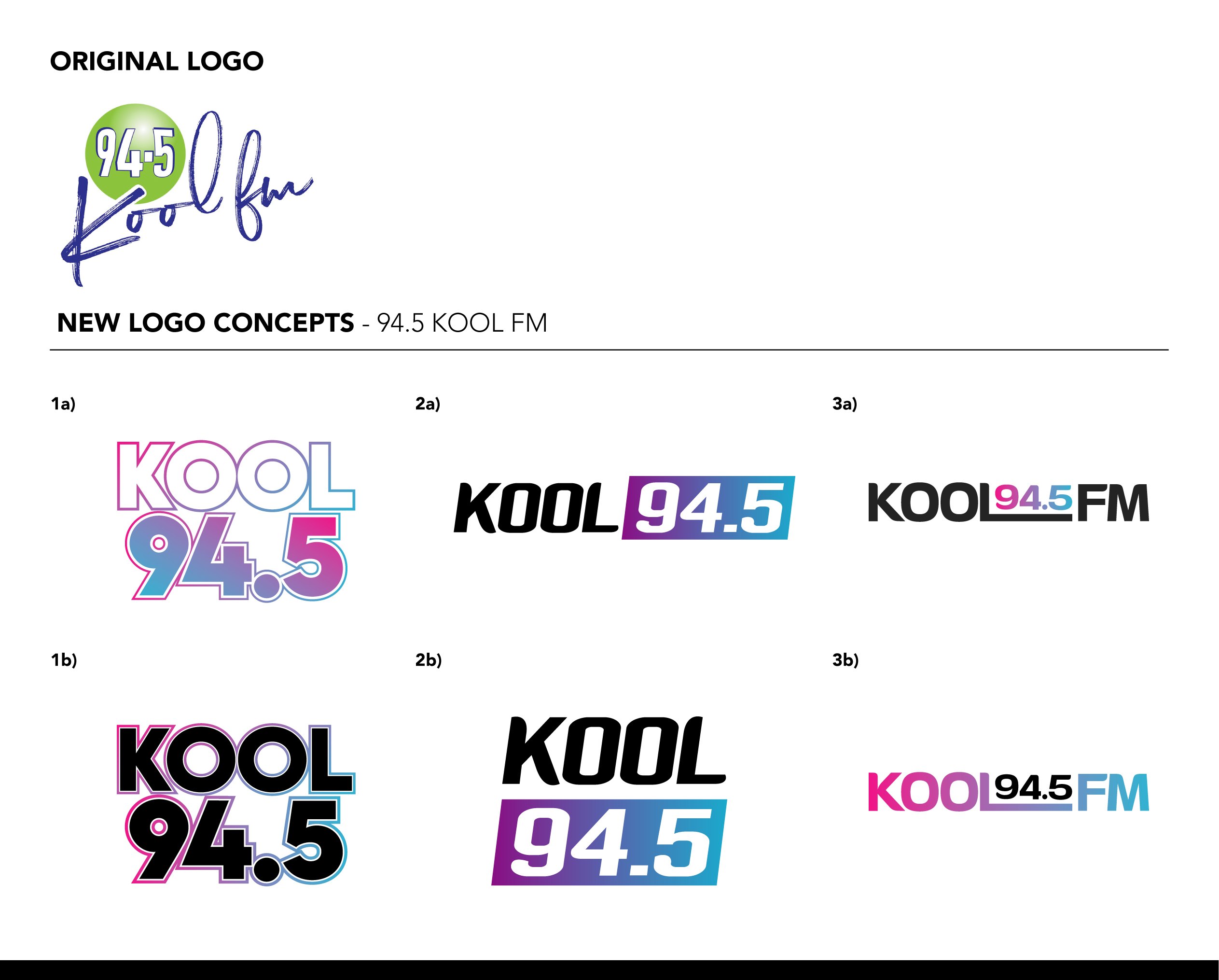
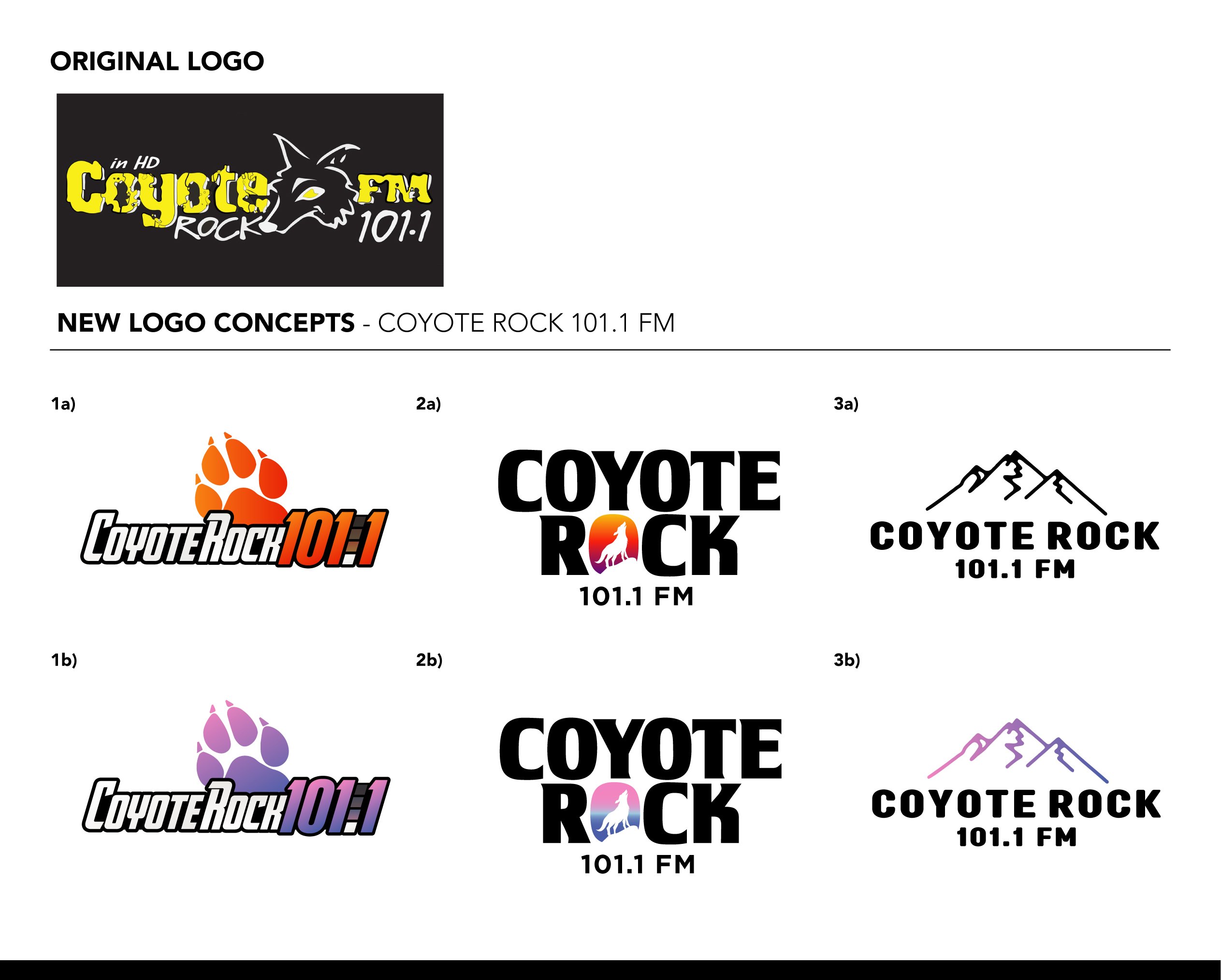
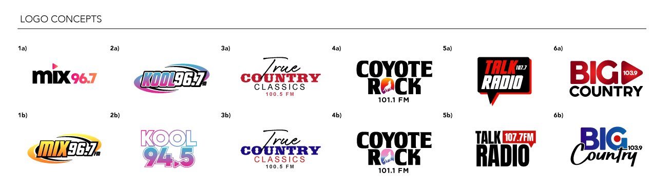
Six concepts per station, each presented beside the original logo, then a final round across the family so the six marks read as siblings without looking alike. A seventh station followed in 2025 with a full logo manual.
Website and Sales Tools
A corporate site built to sell the group to advertisers, with the station lineup, the team and a newsletter signup, plus business cards for every seller carrying all six station logos on the back.
Reintroduction
Billboards, on-air spots, social, email and text campaigns announced the new brands to listeners and advertisers, and a 2025 digital rebrand reel restaged the group for a new chapter.
Services Marketed
Ten Stations, Each Marketed to Its Own Audience
Every station in the group received its own brand, launch and campaign calendar, and the corporate brand was marketed to advertisers across both markets.
Station Brands
Seven Marks, One Family
The final station logos, designed to sit together on a sales card and apart on a billboard.



Process
From the Original Logos to the Final Round
Each station was presented with its original logo at the top and six new directions below, then the family was reviewed together before the finals were cut.
Website, Cards and Guidelines
Built to Sell the Group
The corporate website leads with the station lineup and the team, so a local advertiser sees the whole group in one place. Every seller's card carries the six station marks on the back, and the 2025 Overdrive rebrand shipped with a logo manual covering lockups, palette and type.
Video
The 2025 Digital Rebrand Reel
A vertical reel cut for social and the stations' own channels as the group restaged its brands, with a frequency dial, crowd footage and each station's new mark.

What We Managed
A Brand Department for a Broadcast Group
Impact Summary
Ten Stations That Looked Like One Company
A new broadcaster walked into two markets with a corporate identity, a website, a logo for every station and a card for every seller, reintroduced its stations to their listeners, and restaged the group four years later with a brand system that was still holding.
See How We Brand Media Companies